What Makes a Flower Arrangement Look Expensive? A Florist’s Guide to Luxury Details
An expensive-looking flower arrangement is rarely defined by price alone. You can spend heavily on premium roses, imported peonies, or rare orchids and still end up with a design that feels crowded, generic, or unfinished. At the same time, an experienced florist can take a few seasonal stems, place them in the right vessel, and create something that looks as though it belongs in a luxury hotel lobby or an editorial photo shoot. The difference lies in decisions: color, proportion, movement, mechanics, freshness, and the confidence to leave certain things out.
Luxury floral design is a little like tailoring. Beautiful fabric helps, but fabric alone does not create an elegant suit. The cut, fit, stitching, lining, and finishing determine whether the piece feels ordinary or exceptional. Flowers work the same way. Premium blooms can provide a strong foundation, but the design becomes luxurious only when every stem appears deliberately chosen and every detail supports one clear visual idea.
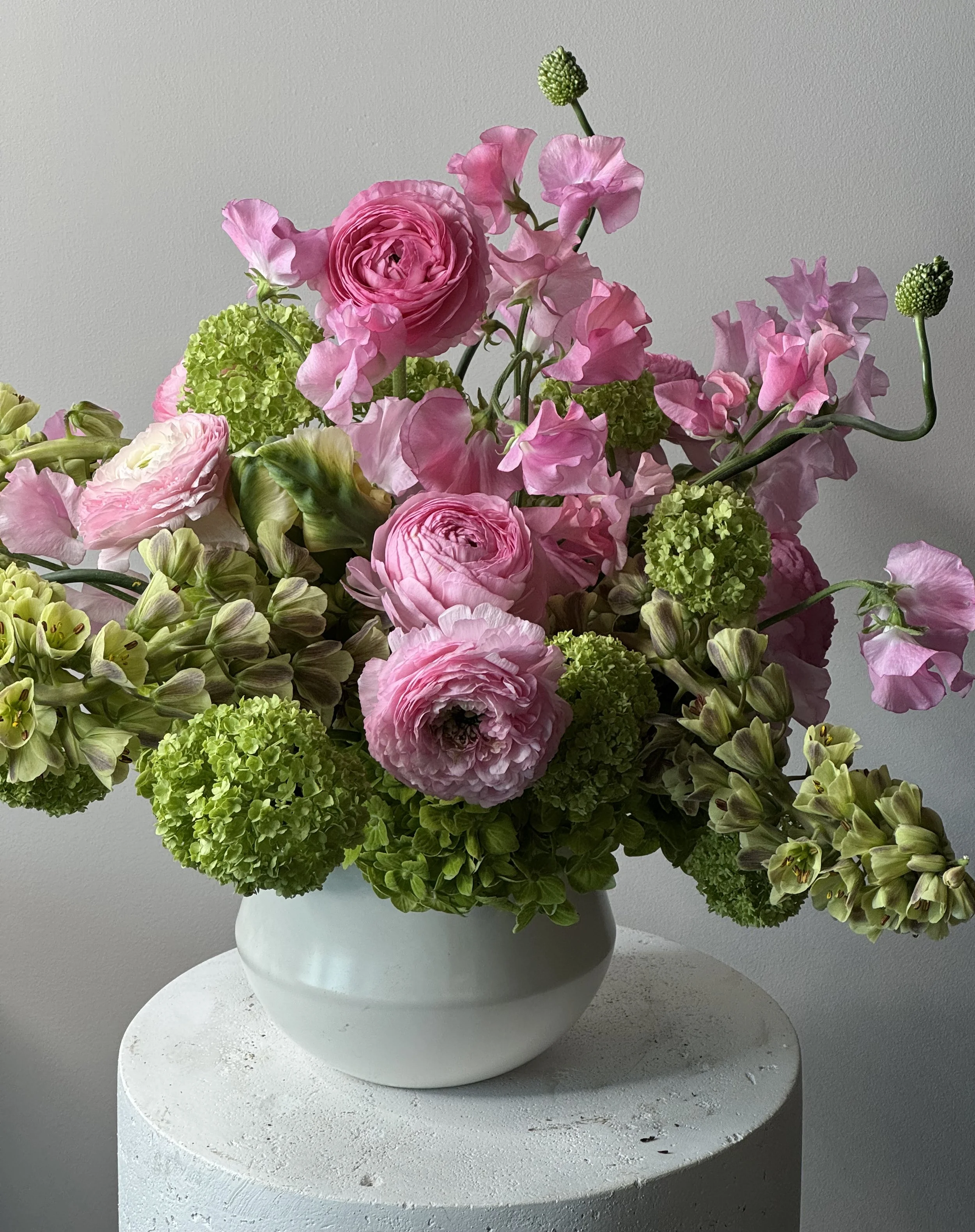
A luxury arrangement also feels connected to its setting. Flowers that look sophisticated on a marble console may overwhelm a narrow dining table. A loose garden arrangement may feel perfect in a historic home but strangely casual in a sleek corporate lobby. Scale and context matter because luxury is not simply abundance. It is appropriateness delivered at an unusually high level.
The good news is that you do not need an unlimited floral budget to achieve that effect. You need to understand how professional florists create hierarchy, control color, hide mechanics, and use space. You also need to recognize when adding one more flower will weaken the arrangement rather than improve it. Once you start seeing those choices, expensive-looking flowers stop feeling mysterious. They become the result of a repeatable design process.
Why Some Arrangements Instantly Read as Luxury
People usually recognize a luxurious floral arrangement before they identify the individual flowers inside it. The first impression comes from the whole composition: its scale, confidence, color harmony, and relationship to the space. An expensive-looking design appears settled and intentional. Nothing seems accidental, even when the flowers have a loose, naturally gathered shape. That quality is difficult to create through random abundance because luxury depends on control.
One major signal is visual hierarchy. The eye knows where to look first. Perhaps a group of garden roses creates the focal point, while orchids, tulips, and foliage guide the gaze outward. Supporting flowers do not compete equally for attention. They establish layers, allowing the arrangement to be understood gradually rather than all at once. A generic mixed bouquet often lacks this structure. Every flower is similar in scale and distributed evenly, so the eye moves across the surface without finding a clear center.
Freshness is another immediate indicator. Luxury flowers appear hydrated, clean, and at the correct stage of opening. Petals are not bruised, leaves are not yellowing, and the water is not cloudy. Even the most expensive flower loses its impact when it looks tired. Professional florists often remove damaged guard petals, clean stems carefully, and choose blooms that will continue opening after installation. This preparation may be invisible, but the result feels polished.
Restraint also creates value. An arrangement does not need every popular flower at once. Designs that include roses, lilies, hydrangeas, carnations, daisies, eucalyptus, and multiple fillers can feel busy, even when each element is attractive. Luxury arrangements usually limit the visual vocabulary. They repeat a few shapes or colors with confidence.
Finally, expensive-looking flowers have breathing room. Individual stems remain visible, petals are not crushed together, and the arrangement relates comfortably to the vessel. It feels composed rather than stuffed. That combination of hierarchy, freshness, repetition, and space creates the quiet confidence we associate with luxury.
Begin With a Strong Design Concept
A luxury arrangement begins before the florist touches a stem. It starts with a clear concept. Without that direction, flower selection becomes a series of isolated decisions: one beautiful rose, an interesting orchid, a dramatic branch, another color that seems appealing. The final arrangement may contain excellent materials, yet it lacks a central idea. Strong design requires editing, and editing is only possible when you know what the arrangement is supposed to communicate.
The concept can be expressed through three descriptive words. For example, soft, architectural, and modern might lead to white calla lilies, pale orchids, tulips, and sculptural leaves in a matte ceramic vessel. Romantic, garden-inspired, and warm could suggest peach garden roses, ranunculus, sweet peas, flowering branches, and trailing greenery. Dark, artistic, and intimate may result in burgundy dahlias, plum calla lilies, smoky foliage, and an asymmetrical vessel.
These words guide shape as well as flower selection. A modern arrangement may use stronger lines and visible negative space. A romantic design may feel fuller and softer, with layered petals and natural movement. A dramatic composition may rely on contrast, deeper colors, or an unexpected silhouette. Once the emotional direction is clear, individual choices become easier because every stem must support the concept.
The setting should also be part of the idea. A dining centerpiece needs to encourage conversation, while an entry arrangement can create a stronger vertical statement. A luxury hotel lobby may require flowers that remain visible from across the room. A bedside arrangement should feel intimate and restrained. The same floral recipe cannot serve every purpose equally well.
Professional-looking arrangements rarely appear indecisive. They commit to one mood, one primary shape, and one palette. That does not mean the design must be simple or minimal. It means complexity is organized around a recognizable point of view. When the concept is strong, the flowers feel like a complete sentence rather than a collection of attractive words placed beside one another.
Use Fewer Flower Varieties With Greater Intention
One of the clearest ways to make an arrangement look more expensive is to reduce the number of flower varieties and increase the repetition of each one. This may seem counterintuitive. People often assume that luxury means including as many premium flowers as possible. In practice, too much variety can make a design feel like a florist’s sample board rather than a carefully composed arrangement.
Imagine a vase containing one rose, one tulip, one lily, one orchid, one hydrangea, one carnation, and several fillers. The arrangement may be colorful, but every flower asks for equal attention. Now imagine twelve tulips arranged with six ranunculus and one sculptural branch. The second design feels stronger because repetition creates visual confidence. The flowers appear chosen for a reason rather than gathered from whatever was available.
Luxury fashion often relies on the same principle. A tailored monochromatic outfit can appear more expensive than one containing many decorative details. Floral design benefits from this discipline. Repeating one focal flower allows its shape and color to become recognizable. Supporting flowers then create depth without distracting from the main idea.
Three to five botanical ingredients are often enough for a sophisticated arrangement. One may serve as the focal flower, another as the supporting bloom, a third as a line or movement element, and the remaining materials may provide texture or foliage. A minimalist design may use only one or two varieties. A large garden-style installation may include more, but the colors and shapes are still organized into repeated groups.
Grouping matters as much as quantity. Florists often place several stems of the same flower together rather than distributing them evenly. A cluster of peach roses creates more impact than isolated roses scattered around the vessel. The eye reads the cluster as a deliberate color moment.
Fewer varieties also make affordable flowers look more valuable. Twenty carnations in one nuanced shade can appear sculptural and modern. A single-variety bouquet of tulips can feel more luxurious than a mixed bouquet containing costlier blooms. Intention creates value because it replaces visual noise with clarity.
Invest in Focal Blooms, Not Just More Stems
When working with a limited budget, many people focus on quantity. They buy enough flowers to make the arrangement look full, then discover that the result still feels ordinary. Luxury design is rarely about filling every gap. It is about establishing memorable focal points. A few exceptional blooms can elevate an entire arrangement when they are supported intelligently.
Focal flowers are the blooms that attract attention first. Garden roses, peonies, orchids, dahlias, ranunculus, anthuriums, hydrangeas, and calla lilies can all serve this role, depending on the desired style. They do not need to be the largest flowers, but they should have enough visual character to anchor the composition. Their color, form, or texture should express the main idea of the arrangement.
You can invest in a small number of premium stems and combine them with simpler materials. Three garden roses may be paired with standard roses in a similar tone, seasonal tulips, or elegant foliage. A few cymbidium orchids can transform a design built from carnations and branches. One dramatic anthurium can sharpen a soft arrangement of lisianthus and greenery. The premium flower becomes the jewelry, not the entire outfit.
Placement determines whether the focal flowers feel valuable. Do not hide expensive blooms deep inside the arrangement. Position them where their shape can be seen, but avoid placing every focal flower at the exact same height. Some may sit near the vessel, while others rise slightly or face different directions. This variation makes the design feel natural and dimensional.
Scale also matters. A small arrangement may need only one or two standout blooms. A large lobby installation requires repeated focal areas so the design remains visually balanced from a distance. The goal is not to count stems equally. It is to distribute impact.
Buying more flowers can increase fullness, but it does not automatically increase sophistication. A luxury arrangement uses premium material strategically. The viewer remembers the expressive rose, the curving orchid, or the sculptural branch, while the supporting flowers quietly complete the composition.
Build Depth Through Tonal Color
Color is one of the fastest ways to make an arrangement look either sophisticated or inexpensive. Luxury floral palettes usually contain depth, even when they appear simple. An all-white arrangement may include ivory, cream, soft beige, pale green, and a touch of gray. A pink design may layer blush, dusty rose, mauve, peach, and one deeper burgundy accent. These tonal differences prevent the flowers from becoming a flat block of color.
Exact matching often weakens natural materials. Flowers contain undertones, irregularities, and subtle shifts as they open. Trying to force every stem into one identical shade can make the arrangement look artificial. A more refined approach builds a family of related colors. The eye recognizes harmony while still discovering variation.
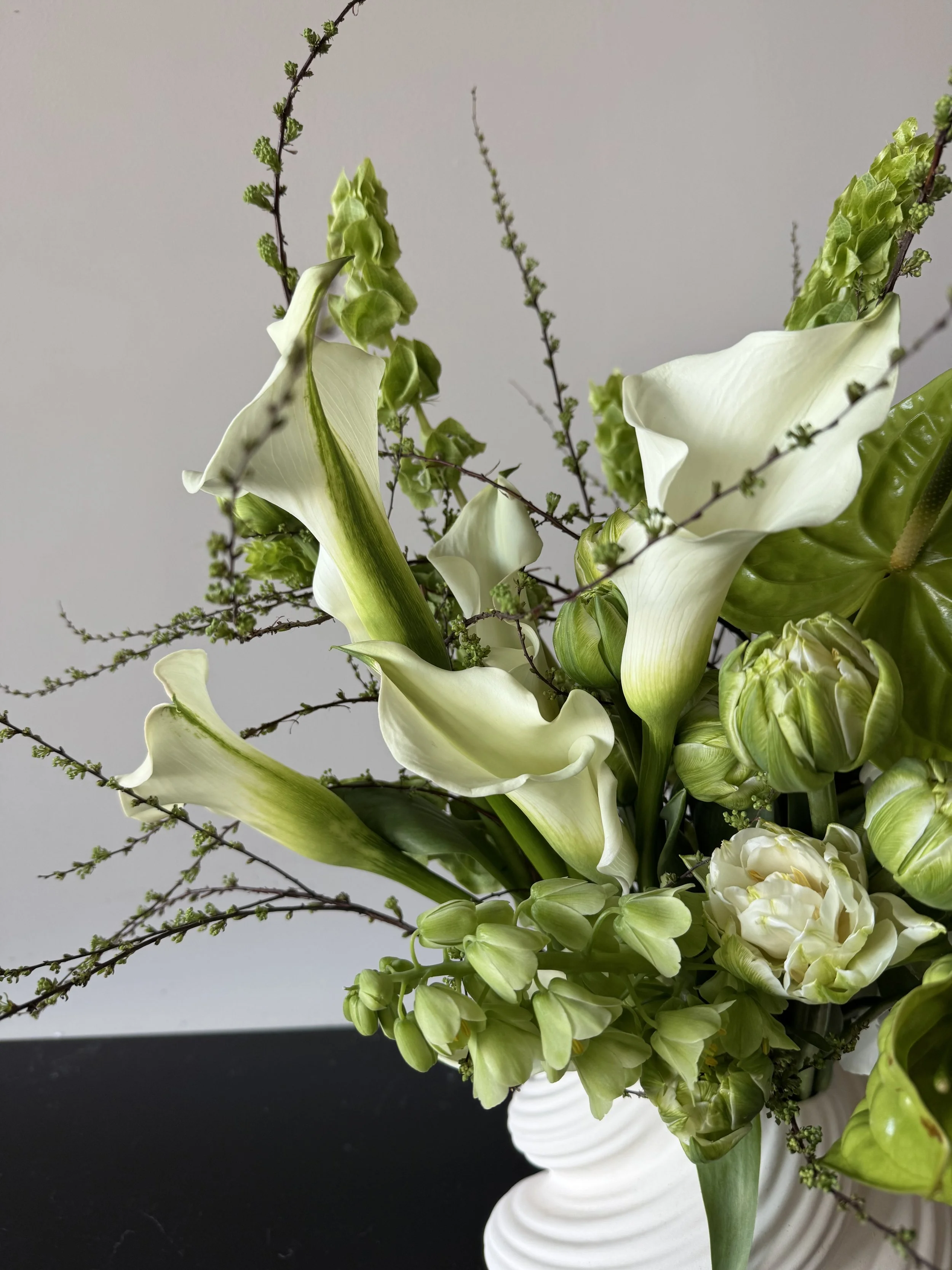
Begin with a dominant tone. This color should occupy most of the arrangement and establish its emotional direction. Add a supporting shade that creates warmth or coolness, then introduce a smaller accent for contrast. A cream arrangement might use pale yellow as the supporting tone and olive green as the accent. A lavender arrangement could include soft blue, white, and one small moment of plum.
Neutral colors are especially important. Green foliage, brown branches, cream petals, gray leaves, and dark stems help brighter flowers feel grounded. Without neutrals, colorful arrangements can look juvenile or overly busy. The neutral materials create visual pauses and connect the flowers to furniture, walls, and vessels.
Luxury Palette
Dominant Tones
Accent Direction
Overall Effect
Layered White
Ivory, cream, pale green
Soft gray or beige
Quiet and refined
Warm Romantic
Blush, peach, apricot
Mauve or caramel
Rich and inviting
Cool Editorial
Lavender, blue-gray, white
Plum or silver green
Modern and composed
Moody Luxury
Burgundy, rust, plum
Cream or black foliage
Dramatic and artistic
Botanical Neutral
Green, ivory, brown
Pale yellow
Natural and architectural
Color should also respond to the room. Pale arrangements need contrast against white walls, while dark flowers may disappear in dim interiors. Luxury comes from balance. The palette should feel connected to its surroundings but distinct enough to be noticed.
Let Shape and Negative Space Create Sophistication
Expensive-looking arrangements are often defined by the space between flowers as much as the flowers themselves. Negative space allows individual stems to remain visible and gives the composition movement. When every gap is filled, the design can become dense, heavy, and visually confusing. Luxury arrangements know when to stop.
Shape should feel intentional from the beginning. A low, asymmetrical bowl may extend gently to one side. A tall branch arrangement might create a narrow vertical line with a few flowers concentrated near the base. A sculptural design may use one curved stem to lead the eye upward. The arrangement does not need to be symmetrical, but it must feel balanced.
Balance differs from sameness. Two sides of an arrangement can have different heights and flower quantities while still carrying equal visual weight. A long branch on the left may be balanced by a dense group of roses on the right. This kind of asymmetry feels more natural and contemporary than a perfectly mirrored dome.
Negative space also gives premium flowers room to show their form. A calla lily loses its elegance when buried inside a crowded bouquet. An orchid becomes more expressive when its stem can curve through open space. Even roses look more luxurious when individual petals and profiles remain visible.
The vessel should participate in the shape. A wide low bowl encourages a spreading composition. A narrow vase supports vertical lines. A sculptural container may require fewer flowers because the vessel itself contributes to the visual statement. Forcing the same rounded arrangement into every container usually produces generic results.
Professional florists often step back from the arrangement repeatedly. From a distance, they evaluate silhouette, proportion, and empty areas rather than focusing only on individual petals. This habit helps reveal where the design feels too heavy or where one stem creates unnecessary tension.
Luxury shape feels confident. It does not apologize for empty space or try to prove value through density. The flowers, vessel, and air around them work together. That breathing room allows the arrangement to feel elegant rather than simply full.
Choose Vessels That Look Custom
A beautiful arrangement can lose much of its impact when placed in a generic or poorly proportioned vase. The vessel is not an afterthought. It is the foundation of the design and one of the strongest signals of luxury. A container that appears carefully selected makes the flowers feel custom, while an unrelated vase can make even premium blooms look temporary.
Material sets the tone. Matte ceramic feels contemporary and understated. Stoneware adds natural texture and visual weight. Clear glass can appear light and refined when the stems are clean and intentionally arranged. Brass, silver, or dark metal introduces polish, while handmade pottery creates a more personal, collected atmosphere.
Color should support the floral palette. A cream ceramic bowl can soften white and blush flowers. A black vessel creates drama with green or burgundy blooms. Smoked glass adds depth to mauve, plum, and neutral arrangements. The vessel does not need to match the flowers, but the relationship should feel deliberate.
The opening determines how the arrangement behaves. Narrow-necked vases support simple single-variety designs and require fewer stems. Wide bowls allow for low, layered compositions but need proper internal mechanics. Tall cylinders create clean vertical forms, while footed compotes produce a romantic garden-style silhouette.
Luxury vessels also have visual weight. A tiny lightweight vase beneath a large arrangement feels unstable and inexpensive. A broad ceramic bowl under five delicate stems may look unnecessarily heavy. The container and flowers should appear physically and visually balanced.
Avoid overly decorative vessels when the flowers already contain many colors and textures. Patterns, logos, bows, and novelty shapes can compete with the arrangement. Luxury usually comes from strong materials and proportion rather than decorative excess.
Rental vessels are common in professional floral design because they allow the container to match the venue and arrangement without becoming wasteful. At home, building a small collection of versatile vessels can create the same effect. One low ceramic bowl, one tall sculptural vase, several bud vases, and one clear glass container can support many styles.
When the vessel looks intentional, the entire arrangement feels more permanent and considered. It appears designed for the room rather than delivered in a temporary container.
Hide Mechanics and Finish Every Angle
Luxury floral design often appears effortless because the mechanics remain invisible. The viewer sees flowers emerging naturally from the vessel, not tape, foam, wire, rubber bands, damaged stems, or plastic packaging. Hiding those working elements is one of the clearest differences between an amateur arrangement and a professionally finished design.
Mechanics are essential because flowers need structure and water. Floral frogs, pin holders, reusable wire grids, internal frameworks, water tubes, and carefully placed support stems can all help create shape. The method should suit the vessel, flower type, and environmental conditions. A large installation requires stronger engineering than a small vase arrangement, but the principle remains the same: support should be secure without becoming part of the visual distraction.
Stem cleanliness matters in transparent vessels. Leaves below the waterline should be removed, stems should be evenly trimmed, and cloudy water should never be visible. If the stems look disorganized, a clear vase may expose every unfinished detail. In that case, a ceramic or opaque vessel may be more appropriate.
The back of the arrangement matters too. Flowers placed on a dining table, kitchen island, or reception desk may be viewed from every direction. A luxurious design should not have one beautiful front and an unfinished back filled with stems and foliage. Even one-sided arrangements placed against a wall should look clean from the sides.
Finishing includes removing bruised petals, clipped leaves, visible thorns, broken branches, and stray pieces of floral tape. Ribbon should be cut neatly. Containers should be dry on the outside and protected underneath. Water marks on a table can ruin the impression of an otherwise elegant arrangement.
Professional florists also inspect the space around the flowers. Packaging, stem scraps, water droplets, and discarded leaves are removed. The arrangement is adjusted after being moved because transportation may shift the flowers.
Luxury details are often details the client never consciously notices. They simply experience the arrangement as polished and complete. Invisible mechanics create that effect. The flowers appear natural, but every stem is supported, hydrated, and finished with care.
Balance Texture Without Creating Visual Noise
Texture makes a floral arrangement feel rich, but uncontrolled texture can make it feel chaotic. Luxury design usually includes contrast between smooth, ruffled, glossy, soft, spiky, and branching materials. The skill lies in choosing enough variation to create depth without making every part of the arrangement compete.
Large focal flowers often provide one dominant texture. Garden roses and peonies create layered softness. Orchids and anthuriums offer smooth, polished surfaces. Dahlias introduce repeated geometric petals. Hydrangeas create cloud-like volume. Once the main texture is established, supporting materials should complement it rather than duplicate every possible effect.
A smooth orchid may look more interesting beside delicate grass or a soft rose. A ruffled peony can be sharpened with dark foliage or a clean branch. A mass of carnations becomes more sophisticated when paired with one architectural element. Contrast helps the viewer appreciate each material.
Foliage deserves the same attention as flowers. Glossy leaves feel different from dusty eucalyptus, delicate vines, herbs, ferns, or broad sculptural foliage. Using several unrelated greens can make the arrangement look busy. Choose one or two foliage styles that support the design concept.
Texture should also be distributed unevenly. A dense cluster of ruffled blooms may sit near the vessel, while lighter line flowers extend outward. This creates a transition from visual weight to openness. Evenly scattering every texture across the arrangement can flatten the composition because nothing receives emphasis.
Dried or preserved materials can add interest, but they should be used carefully. Bleached grasses, seed pods, or preserved foliage may suit a modern neutral design. Too many dried elements can make fresh flowers look disconnected or turn the arrangement into a craft project.
The vessel adds another layer. Rough stoneware beneath delicate flowers creates contrast. Clear glass beneath sculptural orchids reinforces smoothness. A heavily textured vessel combined with many highly textured flowers may become excessive.
Luxury texture feels edited. The viewer notices richness without needing to identify every material. Like a well-designed room with linen, wood, metal, and glass, the arrangement becomes interesting because different surfaces support one another.
Match Scale to the Room, Table, and Occasion
Scale is one of the most important and most frequently misunderstood luxury details. An arrangement can contain exquisite flowers and still look inexpensive if it is too small for the room or too large for the surface beneath it. Proper scale makes the design feel integrated with the environment.
Large spaces need visual presence. A hotel lobby, event entrance, tall foyer, or expansive reception desk may require branches, large flower heads, and enough width to remain visible from a distance. A small bouquet placed in the middle of a marble console can look forgotten, even when it contains premium roses. The arrangement needs to acknowledge the architecture around it.
Small spaces require greater restraint. A large floral display on a narrow dining table may block faces, crowd plates, and force guests to move the arrangement. Luxury does not inconvenience people. A low bowl, compact group of bud vases, or one sculptural stem may appear far more refined because it respects the room’s function.
Furniture proportions provide useful guidance. A wide round table can support a broad low centerpiece. A narrow console may handle height but not excessive depth. A coffee table needs flowers low enough to preserve sightlines. A bedside table usually requires only a small arrangement because the surface must also hold practical objects.
The occasion also changes the scale. An everyday home arrangement can feel intimate and relaxed. A wedding ceremony or corporate event needs enough impact to photograph well and remain visible among people, furniture, and architecture. A sympathy arrangement should feel appropriate to the setting rather than designed to compete with other tributes.
Scale applies within the arrangement too. Large hydrangeas beside tiny delicate flowers need transition materials to prevent the design from feeling disconnected. A heavy focal bloom should be balanced by stems with enough length or visual strength.
Professional florists often measure surfaces and study room photographs before designing. They consider ceiling height, walking paths, lighting, and viewing distance. That preparation prevents the arrangement from feeling separate from its environment.
An expensive-looking arrangement seems to belong exactly where it has been placed. It does not shrink inside the room or dominate it. The scale feels inevitable, which is one of luxury design’s most convincing qualities.
Make Seasonal Flowers Look More Valuable
Seasonal flowers often look more luxurious than out-of-season flowers because they appear fresh, abundant, and naturally expressive. The challenge is presenting them in a way that feels intentional rather than casual. A bunch of spring tulips or summer zinnias can look extraordinarily expensive when color, repetition, and vessel choice are handled well.
The first step is choosing flowers at their best. Spring offers tulips, ranunculus, anemones, sweet peas, narcissus, hellebores, and flowering branches. Summer brings garden roses, cosmos, zinnias, delphinium, hydrangeas, herbs, and local field flowers. Fall provides dahlias, chrysanthemums, berries, grasses, and seed heads. Winter supports orchids, amaryllis, ranunculus, anemones, hellebores, evergreen accents, and bare branches.
Do not disguise seasonal flowers with too many unrelated imported blooms. Their natural character is part of their value. A large bundle of local dahlias in one color family can look richer than a mixed arrangement containing several premium flowers. Flowering branches can create dramatic scale with relatively few stems. Tulips can appear sculptural when allowed to bend naturally instead of being forced into a rigid dome.
Color discipline elevates familiar varieties. Grocery-store chrysanthemums in cream, caramel, and mauve can look highly refined when arranged without bright filler. Zinnias become editorial when grouped in coral, rust, and burgundy. Sunflowers look more sophisticated when paired with olive foliage and cream flowers rather than purple filler and shiny wrapping.
Vessels make seasonal flowers feel considered. Garden stems in a handmade ceramic bowl appear different from the same stems in a plastic sleeve. A tall stone vase can transform branches into an architectural statement. Clear bud vases can turn individual field flowers into a curated table composition.
Seasonality also creates scarcity. Peonies, lilacs, and dahlias feel special because their best natural windows are limited. Instead of demanding them year-round, celebrating their arrival makes the arrangement feel connected to time and place.
Luxury does not always mean rare. It can mean selecting an abundant seasonal material, presenting it with restraint, and allowing its natural character to become the entire design story.
Handle, Condition, and Edit Flowers Like a Professional
Freshness is one of the strongest visual markers of luxury, and freshness begins with conditioning. Professional florists do not simply unwrap flowers and place them in a vase. They clean, hydrate, inspect, trim, rest, and edit every stem before it enters the arrangement. This preparation affects both appearance and longevity.
Begin with clean tools and containers. Bacteria can block stems and cloud water, making flowers decline quickly. Wash vases thoroughly, use sharp floral snips or a clean knife, and remove leaves that would sit below the waterline. Recut stems before placing them in fresh water, then allow the flowers to hydrate in a cool space away from direct sunlight.
Different flowers need different handling. Roses may require the removal of bruised outer guard petals. Hydrangeas need reliable hydration and should not remain dry for long periods. Tulips continue growing and bending after arranging. Woody branches may need a fresh angled cut and a deeper water source. Delicate sweet peas require gentle handling because their stems and petals bruise easily.
Editing continues during the design process. Remove any flower that weakens the arrangement, even when it was expensive. A damaged bloom attracts attention for the wrong reason. Cut off yellowing leaves, broken tips, and unnecessary side growth. Rotate flowers so their most expressive faces remain visible.
Professional editing also means knowing when the arrangement is finished. Adding stems simply because they are available can destroy negative space and hierarchy. Step away, look at the silhouette, and remove anything that feels crowded or repetitive.
Care after arranging matters equally. Top up water, keep flowers away from heat and ripening fruit, and remove declining stems. A luxurious arrangement should not remain on display after it loses freshness. Dividing it into smaller vases may extend the best flowers for several more days.
Handling creates the invisible polish behind expensive-looking design. The flowers appear effortless because the damaged, distracting, and unhealthy parts have been removed. What remains is the strongest possible version of each stem.
Create Luxury at Different Budget Levels
Luxury floral design can exist at many price points because the visual principles remain the same. A larger budget provides access to specialty flowers, complex installations, custom vessels, and professional labor, but it does not replace good decisions. A limited budget can still create elegance through repetition, color control, proper scale, and careful finishing.
At a lower budget, focus on one or two flower varieties. Tulips, carnations, chrysanthemums, alstroemeria, standard roses, and seasonal market flowers can look refined when grouped by color. Avoid mixed bouquets containing many unrelated shades and fillers. A mass of twenty cream carnations in a low ceramic bowl can feel sculptural and modern.
Use branches and foliage to create scale. One or two expressive branches can add height and movement without requiring dozens of premium stems. Garden greenery, herbs, or seasonal leaves can support the arrangement when they are clean, safe, and used sparingly.
At a moderate budget, combine a few premium focal flowers with more affordable supporting material. Garden roses can be paired with standard roses and tulips. Orchids can be added to carnations and foliage. Ranunculus can bring detail to an arrangement built from lisianthus and seasonal branches.
A high budget allows for specialty varieties, large installations, custom color sourcing, premium vessels, and professional delivery. Even then, the design should remain edited. Expensive flowers placed without hierarchy can still look ordinary.
Budget Level
Luxury Strategy
Best Materials
Simple
Repetition and monochromatic color
Tulips, carnations, chrysanthemums
Moderate
Premium focal blooms with seasonal support
Ranunculus, roses, lisianthus, branches
Elevated
Specialty flowers and custom vessels
Orchids, peonies, garden roses, anthuriums
Statement
Large-scale professional design
Branches, installations, repeated focal flowers
Spend first on freshness and vessel quality. A clean, well-proportioned arrangement will always look better than a larger design filled with aging flowers. Luxury is the result of consistency. The budget determines the materials, but taste determines how valuable they appear.
Conclusion
An expensive-looking flower arrangement is created through design intelligence rather than price alone. Premium flowers help, but they cannot compensate for poor scale, weak color choices, visible mechanics, or a crowded composition. Luxury appears when every element feels deliberate.
Begin with one strong concept. Choose a mood, palette, and shape before selecting individual flowers. Limit the number of varieties and repeat them in clusters so the arrangement develops visual confidence. Invest in several expressive focal blooms rather than filling the vessel with unrelated stems.
Use tonal color to create depth. Layer cream with ivory, blush with apricot, or lavender with blue-gray instead of forcing exact matches. Let neutral foliage, branches, and negative space give the brighter flowers room to breathe. Luxury design is often quieter than people expect.
The vessel should feel selected for the flowers and the room. Materials, color, opening size, and visual weight all influence the result. Mechanics should remain hidden, water should be clean, and every visible angle should appear complete. Those finishing details may not attract direct attention, but they determine whether the arrangement feels polished.
Scale must respond to the environment. Large rooms need enough presence, while intimate tables require restraint. Seasonal flowers can look extraordinarily valuable when presented with repetition and confidence. Familiar carnations, tulips, chrysanthemums, and branches often become luxurious through intelligent styling.
Professional handling completes the effect. Condition stems, remove damaged petals, clean the vessel, and edit the arrangement before it becomes crowded. Freshness is not negotiable. A smaller arrangement in perfect condition will always look more expensive than a large display that has begun to fade.
Luxury floral design is ultimately about clarity. The arrangement knows what it wants to be. It does not rely on excess, decoration, or price tags to prove its value. It looks expensive because every choice—from the first flower to the final placement—feels considered.