Flowers for Art Gallery Openings: How Floral Design Can Complement the Exhibition
An art gallery opening already has a lot happening before the first guest even walks through the door. There are artworks to hang, labels to proof, lights to focus, collectors to confirm, artists to calm down, press to coordinate, wine to chill, and approximately fifty tiny things that somehow become urgent at the exact same time. In that environment, flowers for art gallery openings can look like a decorative afterthought. They should not be. Thoughtful floral design can quietly shape how people experience the exhibition from the moment they arrive, but only when the flowers understand their place in the room.
That last part matters. An art opening is not a wedding reception with paintings on the walls. The art is the reason people are there. Floral design should support the exhibition, extend its visual language, or create atmosphere around it without stepping forward and demanding equal attention. A gallery filled with enormous arrangements can easily feel like a flower event that happens to contain art. On the other hand, one sculptural branch, a restrained field of white blooms, or a carefully placed arrangement near the reception desk can subtly reinforce the curator's intent and make the entire space feel more considered.
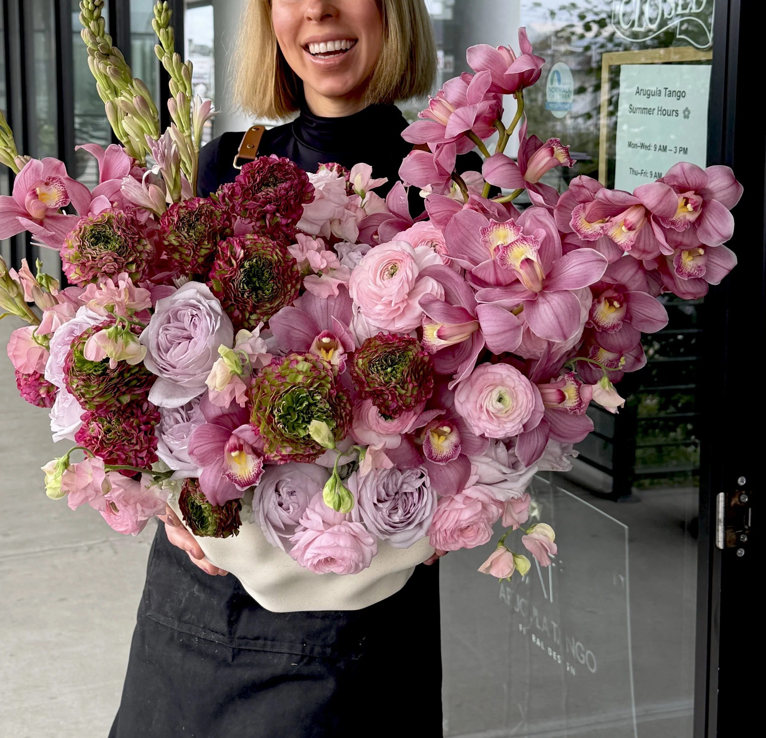
Think of flowers in a gallery as part of the exhibition's supporting cast. They can introduce color before a guest reaches the first work. They can soften a severe industrial room, create intimacy around a reception area, echo organic forms in sculpture, or intentionally contrast with hard-edged contemporary pieces. They can also create visual breathing points where guests naturally pause between rooms.
The strongest floral design for gallery openings begins with questions rather than flowers. What kind of art is being shown? What is the artist trying to communicate? How does the gallery architecture behave? Which colors already dominate the work? Is the show quiet and contemplative, or loud and confrontational? Is it about nature, memory, technology, identity, geometry, decay, luxury, or something else entirely?
Once those questions are clear, flowers become much easier to choose. The goal is not to make the gallery prettier. It is to make the experience more coherent.
Why Floral Design Belongs in an Art Gallery Opening
Flowers and art have always shared a complicated relationship. Flowers have been symbols, subjects, metaphors, still-life material, religious references, decorative motifs, and reminders of mortality across centuries of visual culture. That history alone makes floral design feel surprisingly natural in an exhibition setting. Yet contemporary gallery flowers are most effective when they are not treated as symbolic objects by default. Their primary role is often atmospheric: helping guests feel the tone of the exhibition before they consciously analyze why.
A bare gallery has a very specific energy. White walls, concrete floors, track lighting, open space, and controlled silence are designed to direct attention toward artwork. During an opening, however, that neutrality changes. Suddenly there are people everywhere, glasses clinking, conversations overlapping, staff at a desk, coats moving through the room, and guests trying to navigate around one another. Art gallery floral design can help organize that temporary social layer without interfering with the permanent exhibition logic.
Flowers can signal important areas in a subtle way. An arrangement at the welcome desk tells guests where the event begins. A floral piece near the bar can visually define the hospitality area. A sculptural installation in an otherwise empty transition space can slow traffic and create a natural pause. None of those choices require signs or barriers; the flowers communicate through presence.
They can also shift the emotional temperature of a gallery. A room filled with cold materials—steel, concrete, acrylic, glass—may benefit from one organic counterpoint. Conversely, a soft figurative exhibition might become more interesting when paired with spiky, architectural botanicals rather than romantic garden roses. In that sense, flowers can function much like music at an opening. You may not consciously focus on them, but they influence the way the room feels.
There is also a social dimension. Gallery openings can be intimidating, particularly for guests who do not spend every Thursday night moving between Chelsea, Tribeca, or Lower East Side exhibitions. Flowers create warmth. They make a space feel hosted rather than merely open. That small shift can make visitors linger longer, start conversations more easily, and experience the evening as an event rather than simply a viewing window.
The important distinction is intention. Florals belong in an art opening when they have a clear relationship to the space and exhibition. Random decoration adds noise. Thoughtful floral design adds context.
Start With the Exhibition, Not the Flowers
The easiest mistake in gallery event floral styling is falling in love with a flower before understanding the exhibition. Maybe peonies are in season. Maybe orchids look expensive. Maybe an enormous image of a wild meadow has been circulating on the mood board. None of that matters until the floral designer understands what is happening on the walls, floor, and ceiling.
Start with the artist or artists. Look at the work. Read the exhibition statement. Ask the curator what the central idea is. If the show explores industrial landscapes and technological alienation, a bouquet of pastel garden roses may create an emotional contradiction unless that contrast is deliberate. If the exhibition is built around environmental loss, using highly wasteful imported floral material could undermine the message before anyone reads the wall text.
The physical characteristics of the artwork matter too. Is the work large and saturated, or quiet and monochromatic? Are the pieces tightly hung or given lots of space? Are there sculptures on the floor? Does the exhibition include fragile works, projections, sound, or performance? Floral design must respect all of these elements.
The gallery's architecture is the next layer. A narrow room with a low ceiling needs a different approach from a double-height industrial space. A historic townhouse gallery may already have decorative moldings and visual texture, while a white-cube gallery may offer a much cleaner field. Flowers should respond to that architecture instead of ignoring it.
It also helps to identify what the curator does not want. Some exhibitions need a certain severity. Some artists dislike decorative framing. Some shows are intentionally sparse. In those cases, floral design may belong only at the reception desk, outside the exhibition rooms, or at an opening-night dinner rather than inside the gallery itself.
That restraint can be a sign of good design. Florists are often hired because people expect flowers, but the best designers know that not every available surface needs an arrangement.
A useful way to think about the process is this: the exhibition is the text, and the flowers are punctuation. A comma can help a sentence breathe. An exclamation point can create energy. Too many marks everywhere make the entire thing exhausting.
Start with the art. Let the floral decisions come second.
How to Match Floral Design to the Curatorial Concept
Matching flowers to an exhibition does not mean illustrating the artwork literally. If a painting contains blue, you do not automatically need blue flowers. If the artist paints forests, the opening does not need to become a woodland installation. The more interesting approach is to translate the curatorial concept into floral design through mood, form, texture, rhythm, and material.
Suppose the exhibition is about memory and fragmentation. A floral designer might use partially deconstructed arrangements, isolated stems, translucent vessels, or repeated botanical elements that seem to appear and disappear throughout the space. If the show explores abundance and excess, oversized layered florals might make sense. If the concept centers on absence, a nearly empty arrangement could be far more powerful.
Form is often more useful than color. Curved floral shapes can echo organic sculpture. Vertical stems can reinforce tall architectural work. Branching structures can relate to drawings based on networks or systems. Dense compact masses of flowers may complement paintings built from repeated marks. None of this needs to be obvious. In fact, subtle connections are usually more sophisticated.
Texture can also mirror the exhibition language. Glossy leaves and polished anthuriums can relate to synthetic or highly finished artworks. Seed pods, dried grasses, bark, and rough branches may work with earthy, tactile, or process-driven work. Soft flowers such as sweet peas, ranunculus, or garden roses can introduce fragility into an emotionally delicate exhibition.
Then there is contrast. Sometimes matching the concept too closely makes the entire environment feel overdesigned. A show of severe black-and-white photographs may become more memorable when a single arrangement introduces warm organic color. A lush landscape exhibition might benefit from restrained sculptural flowers rather than more greenery.
The exhibition statement can provide useful language, but floral design should not attempt to translate every sentence. Pick one or two ideas. Maybe the show is fundamentally about repetition. Maybe it is about tension. Maybe it is about material transformation. Those are strong enough starting points.
The curator, artist, and florist should ideally speak before design begins. A five-minute conversation about what the work is actually doing can prevent an arrangement from accidentally creating the wrong emotional message.
The best floral response to an exhibition rarely says, “Look, we copied the art.” It feels more like another voice in the same conversation.
Choosing Flowers That Support the Art Without Competing With It
The fear that flowers will compete with artwork is completely reasonable. Flowers are colorful, dimensional, alive, and visually immediate. Humans are naturally drawn to organic forms, which means a large arrangement can easily pull attention away from a painting or sculpture nearby. The solution is not necessarily to eliminate flowers; it is to manage hierarchy carefully.
Start with placement. Flowers should rarely block direct sight lines to artwork. That sounds obvious, but an arrangement can interfere even when it is not physically in front of a piece. A tall centerpiece placed in the middle of a viewing axis may break the visual relationship between two works. A bright bouquet near a subtle drawing may become the most noticeable object in that corner.
Color intensity is another factor. Highly saturated flowers grab attention faster than muted ones. If the exhibition includes delicate graphite drawings, a giant arrangement of neon orange flowers could overwhelm them. In that setting, white, green, dried, tonal, or low-contrast materials may be more appropriate. Conversely, a show of huge colorful paintings can support stronger floral color without losing focus.
Scale matters just as much. One large installation may be easier to control than ten medium-sized arrangements scattered throughout the gallery. Concentrating floral impact in designated social zones keeps viewing areas quieter. This is often the best approach for serious exhibitions: let the reception, bar, entry, and dinner areas carry the floral energy while the artworks retain visual authority inside the galleries.
Container choice also affects competition. Ornate vases introduce another decorative layer. Clear glass, simple ceramic, metal, stone, or sculptural vessels can often support contemporary art more effectively. In some spaces, the container may be almost more important than the flowers because it defines how the arrangement relates to the room.
A good test is to stand at the entrance of each gallery and notice where your eye goes first. If the flowers consistently win, ask whether that is intentional. If not, reduce them, move them, change the color, or simplify the form.
Flowers for art exhibitions should create an atmosphere that makes guests more receptive to the work. They should not behave like additional artworks unless that relationship has been explicitly designed.
The distinction is subtle but important. Supporting design does not disappear. It knows when to be visible and when to step back.
Using Color Theory in Gallery Floral Styling
Color is probably the fastest way for floral design to either support an exhibition or fight with it. Gallery walls may be white, but the room is never visually neutral once art, people, clothing, signage, lighting, and flowers are present. Every additional color changes the balance.
One useful approach is to identify the exhibition's dominant temperature. Is the work mostly warm—reds, ochres, oranges, creams—or cool, with blues, grays, greens, and silvers? Floral design can either stay within that temperature for cohesion or deliberately introduce the opposite for contrast.
Tonal palettes are often elegant in gallery spaces. Instead of choosing one exact color, work within a family: ivory, cream, pale yellow, and green; dusty rose, burgundy, plum, and chocolate; or blue-gray, lavender, and cool white. This creates visual depth without the arrangement feeling like a rigid color match.
Complementary color can be powerful when used carefully. Blue-heavy paintings may look even more electric near orange accents. Green-heavy installations can become richer with restrained red or burgundy flowers. The key word is restrained. Strong complementary colors create high visual tension, and too much can make the room feel like a branding exercise.
Monochromatic floral design is especially effective in contemporary galleries. An all-white arrangement can become sculptural because the viewer notices shape rather than color variety. All-red florals can feel intense and dramatic. All-green botanical styling may introduce life without behaving like conventional flower decoration.
Black flowers do not truly exist in the pure sense, but very dark burgundy, purple, or brown varieties can create sophisticated nearly-black palettes. Pale flowers under cool gallery lighting can appear almost spectral, which may be useful for certain exhibitions.
Do not forget the people. At an opening, dozens or hundreds of guests add moving color to the space through clothing. An arrangement that feels perfectly balanced in an empty gallery may behave differently once the room fills. This is one reason overly complicated floral palettes can become visually exhausting during crowded events.
Branding also plays a role if a sponsor, gallery identity, or artist publication has a defined color system. Use it carefully. The exhibition should not suddenly look like a corporate launch unless that is genuinely part of the event concept.
Color theory is not about following rules mechanically. It is about understanding visual relationships. The flowers do not exist alone. They exist inside a field of art, architecture, light, and people.
Floral Design for Contemporary and Minimalist Exhibitions
Contemporary and minimalist exhibitions can be deceptively difficult to style because every additional object becomes noticeable. In a busy room, an imperfect arrangement may disappear into the visual environment. In a sparse gallery containing four sculptures and a lot of white space, a flower stem that leans two inches too far can suddenly look like a major design decision.
For minimalist exhibitions, the safest approach is not always to use fewer flowers, but to use them with greater precision. A single variety arranged with strong shape can be more effective than a mixed bouquet. Calla lilies, orchids, anthuriums, tulips, hellebores, or branches can all work beautifully because their individual forms remain clear.
Negative space is essential. Instead of filling a vessel, allow air around the stems. Think about the arrangement as a drawing in space. Each line contributes to the composition. This is particularly effective near sculpture, where the flowers can echo or contrast with the artwork's physical presence.
Containers should usually be simple, but simple does not mean generic. Matte ceramic, brushed metal, stone, smoked glass, or transparent acrylic can work depending on the exhibition. The vessel may need to relate to materials already present in the show.
Color should be controlled. Monochromatic or very limited palettes often feel more natural in minimalist spaces. White flowers with green stems can almost disappear into a white gallery while still adding organic texture. Dark flowers can create graphic punctuation. One saturated color repeated carefully can feel highly intentional.
Contemporary exhibitions also open the door to nontraditional botanical materials. Leaves, grasses, seed pods, moss, branches, fruit, vegetables, or dried elements can sometimes create a stronger relationship with the work than conventional flowers.
That does not mean the floral design has to look severe. Minimalism can still feel warm. A small cluster of soft seasonal blooms may create exactly the human contrast the exhibition needs.
The key is editing. Every stem should earn its place.
A good florist working in this context may remove more material than they add. That discipline is what keeps the arrangement from becoming decoration layered on top of art. Instead, the flowers operate almost like a quiet spatial intervention—present, intentional, and aware of the silence around them.
Flowers for Figurative, Romantic, and Classical Art Shows
Figurative and classically influenced exhibitions often invite richer floral language because flowers already exist within so much of art history. Roses, lilies, tulips, peonies, irises, and other blooms appear throughout painting traditions as symbols of love, purity, transience, wealth, sexuality, devotion, death, and rebirth. That history can give floral styling another layer of meaning.
The danger is becoming too literal. A show inspired by Dutch still-life painting does not automatically require the gallery to be filled with replicas of seventeenth-century bouquets. That can become theatrical very quickly. Instead, borrow the principles: dramatic asymmetry, deep color, unusual botanical combinations, fruit, trailing stems, or flowers at different stages of bloom.
For romantic figurative work, garden-style arrangements can feel natural. Peonies, garden roses, ranunculus, sweet peas, foxglove, delphinium, or flowering branches can create movement and softness. However, the arrangement should still respond to the specific artist. Some contemporary figurative painters use traditional imagery in ironic or unsettling ways, so overly pretty flowers might erase that tension.
Dark floral palettes can be especially effective for exhibitions dealing with memory, mortality, sensuality, or history. Burgundy dahlias, chocolate cosmos, dark foliage, antique roses, and dried materials can create emotional depth without becoming gothic unless intentionally pushed in that direction.
Classical galleries or historic spaces may support more elaborate vessels—stone urns, aged brass, ceramic compotes, or glass bowls. Again, the container should feel connected to the architecture rather than chosen because it looks expensive.
Flowers can also create temporal dialogue. Pairing very modern floral styling with classical art can make the exhibition feel current. Conversely, historically inspired florals can reinforce continuity with the past. Both approaches are valid.
It helps to decide whether the flowers should harmonize with the work or create friction. Harmony makes the evening feel cohesive and immersive. Friction can create intellectual energy.
This is where the curator's perspective becomes especially useful. Classical and figurative exhibitions often carry layers of reference that are not immediately obvious from photographs alone. Floral styling becomes richer when the designer understands whether the artist is embracing tradition, questioning it, or dismantling it.
The flowers should participate in that conversation rather than flatten it into something merely beautiful.
Floral Styling for Photography, Sculpture, and Mixed-Media Exhibitions
Different media create different spatial problems, which means floral design should change accordingly. A photography show behaves differently from a sculpture exhibition. Mixed-media installations may use floors, ceilings, sound, projections, or unusual materials that make conventional flower placement almost impossible.
Photography exhibitions often require controlled visual environments. Works may be framed consistently and hung in sequence, creating a strong rhythm along the walls. Flowers should avoid interrupting that rhythm. It is often better to keep florals near the entrance, reception, seating, or hospitality zones rather than placing arrangements between photographic works.
Black-and-white photography can pair beautifully with restrained floral palettes. White flowers, dark foliage, green branches, or one saturated color can create strong contrast without visually confusing the images. Color photography requires more careful palette selection because the flowers become another source of chromatic information in the room.
Sculpture exhibitions present another challenge: the floor is already active. A floral arrangement placed on a pedestal may easily be mistaken for part of the show, while floor-based flowers could interfere with circulation or sight lines. In these cases, overhead installations, wall-adjacent arrangements, or flowers positioned clearly within hospitality zones may be more appropriate.
Mixed-media shows often create opportunities for more experimental botanical design. If the exhibition includes textiles, sound, video, found objects, or immersive environments, floral styling can respond materially rather than decoratively. Dried plants, unusual botanical forms, suspended elements, or repeated organic materials may work better than traditional bouquets.
Projection-based art requires special care. Flowers can cast shadows, block projectors, or reflect light unexpectedly. Sound installations may need clear speaker pathways. Performance work requires open circulation and safety.
This is why venue and exhibition walkthroughs are so valuable. A floral designer can understand far more from standing inside the finished or partially installed show than from looking at a floor plan.
The medium determines how viewers move. Photographs often encourage close frontal viewing. Sculpture invites circulation around objects. Immersive work may pull visitors into defined environments. Flowers should never disrupt that choreography.
Good floral styling for exhibitions respects how people encounter the art physically. The arrangements become part of the spatial logic rather than an obstacle inserted into it.
Designing the Gallery Entrance and Opening-Night Welcome
The entrance is one of the safest and most effective places to use flowers because it allows the gallery to create atmosphere before guests engage directly with the work. It can signal that opening night is special without cluttering the exhibition rooms.
The right entrance treatment depends on the gallery's architecture. A small Lower East Side storefront may need only a sculptural arrangement beside the door. A large Chelsea gallery might support taller branches or a statement installation in the lobby. A historic townhouse could use flowers on a console or staircase. A warehouse space may benefit from something larger that can hold its own against industrial scale.
Avoid defaulting to a floral arch unless it genuinely suits the gallery. Arches are strongly associated with weddings, branded events, and photo activations. They can work, but in a serious art context they often feel too ceremonial unless interpreted in a highly architectural way.
One strong arrangement can be more sophisticated. Imagine a tall, asymmetrical composition near the reception desk that introduces the exhibition's palette without reproducing it. Guests see it immediately, understand the tone, and then move naturally toward the artwork.
The welcome desk is another excellent location because it is already functional. Flowers can soften the practical visual elements—guest lists, card readers, publications, coat-check tickets—without occupying viewing space.
Exterior flowers need additional planning. Weather, wind, sidewalk traffic, building rules, and security all matter. Flowers outside can attract attention from passersby, but they should not create an obstacle or make the gallery entrance look like a retail grand opening unless that is the desired effect.
Opening signage can interact with floral design. Flowers may frame the exhibition title or artist name, but avoid blocking text. If press photography is expected, test the sight line from the entrance.
The entrance also sets expectations about scale. A dramatic botanical installation suggests an immersive event. A single stem in a stone vessel suggests restraint. Neither is inherently better.
What matters is consistency. The welcome moment should introduce the visual language guests will encounter inside. Think of it as the first line of the exhibition experience—not the entire story, just enough to make people want to continue.
Where to Place Flowers Inside an Art Gallery
Placement is where floral design becomes spatial strategy. You can choose the perfect flowers and still weaken the exhibition if they are positioned badly.
Start with circulation. Watch how visitors are expected to move through the gallery. Doorways, narrow passages, turning points, seating, bars, and reception areas naturally create zones. Flowers should support those paths rather than narrowing them.
Never place arrangements where guests need to lean around them to see artwork. Do not create accidental trip hazards. Avoid placing water-filled vessels near electrical equipment, sculpture bases, or fragile works. These rules sound practical because they are, but practical details often determine whether floral design feels elegant or chaotic.
Corners can be useful. A visually dead corner away from important work may become more inviting with a tall arrangement. Windowsills can support small botanical elements if the architecture allows it. Reception desks, bar tops, and side tables are obvious locations because they already have a functional role.
Pedestals require caution. In a gallery, anything on a pedestal may be interpreted as art. If flowers are placed on one, the distinction should be deliberate and visually clear. That ambiguity can be interesting if the artist and curator approve, but confusing if it happens by accident.
Transitions between rooms are particularly powerful. A floral element can mark the shift from one part of an exhibition to another, especially if the curatorial sections have different moods. Flowers can work almost like chapter breaks.
Seating areas are another opportunity. A bench or lounge space can feel more intentional with a nearby arrangement, particularly during an opening when guests need places to gather and talk.
Bathrooms are often overlooked but can carry a small echo of the main floral palette. One stem or compact arrangement can make the event feel considered without consuming budget.
If the gallery includes a private viewing room, sales office, or collector lounge, florals there can be slightly more generous because the environment is more social and less exhibition-focused.
One useful method is to categorize spaces into three levels: art-first, transition, and hospitality. Art-first areas receive little or no floral styling. Transition areas use restrained botanical elements. Hospitality areas carry the strongest arrangements.
That framework keeps flowers present without allowing them to take over.
Scale, Negative Space, and Visual Balance
Scale can completely change the meaning of flowers in a gallery. A single branch in a twenty-foot room can feel poetic. The same branch on a crowded bar may look unfinished. A huge installation can feel magnificent in a warehouse and absurd in a narrow corridor.
The gallery itself should dictate scale before flower preference does.
Large rooms need arrangements with enough visual presence to register from a distance. That does not necessarily mean more flowers. Tall branches, long stems, or architectural foliage can create scale efficiently. A few materials used boldly can be more effective than hundreds of small blossoms.
Small galleries benefit from restraint. Guests are often physically close to everything, which means flowers do not need to work hard to be seen. Compact compositions or single-variety arrangements may be enough.
Negative space is especially important in exhibitions because viewers need visual rest. If every table, ledge, corner, and surface contains flowers, the room loses hierarchy. Empty space allows both art and florals to feel more intentional.
This is similar to composition in painting or photography. What is absent can carry as much visual weight as what is present.
Balance does not have to mean symmetry. In fact, asymmetry often feels more natural in gallery settings. One tall arrangement may be balanced by open space rather than another matching arrangement on the opposite side. Repetition can happen through color or material instead of identical shape.
Consider vertical balance too. If all the art sits around eye level and all the flowers stay low, the room may feel visually compressed. Taller botanical forms can create movement upward. Conversely, if an exhibition already uses ceiling-hung elements, keeping flowers low may preserve clarity.
Crowd density changes scale. A floral installation that looks huge in an empty room may become almost invisible once 200 guests arrive. Opening-night design must account for bodies as part of the visual environment.
Photographs can help evaluate balance before the event, but standing in the gallery remains essential. Human perception is spatial. You notice distances, ceiling height, and visual weight differently in person.
The goal is not to fill the room evenly. It is to create a rhythm: art, space, people, flowers, space again. That rhythm makes the event feel composed rather than decorated.
Seasonal Flowers for Art Gallery Openings
Seasonality can give gallery flowers a sense of authenticity that imported year-round designs often lack. When flowers reflect the actual moment in the calendar, they connect the exhibition to time and place—even if guests never consciously think about it.
Spring offers some of the most expressive materials: flowering branches, tulips, ranunculus, hellebores, sweet peas, narcissus, and peonies later in the season. These flowers can feel fresh, transitional, and slightly unpredictable, which makes them useful for exhibitions dealing with renewal, landscape, youth, or transformation.
Summer brings abundance. Dahlias, cosmos, zinnias, garden roses, delphinium, sunflowers, and many local field-grown flowers become available. Summer florals can easily become exuberant, so gallery styling often benefits from editing them carefully.
Fall introduces richer texture. Grasses, seed heads, berries, branches, chrysanthemums, dahlias, amaranthus, and fading foliage can create complex arrangements that feel less conventionally floral. This season is especially strong for exhibitions with earthy, material, or contemplative themes.
Winter demands a different approach. Branches, evergreens, dried botanicals, amaryllis, orchids, hellebores, and sculptural foliage can create strong forms when local fresh-flower options are limited. Winter florals do not need to look holiday-themed. Avoid automatic red-and-green palettes unless they support the exhibition.
Seasonality also affects quality and budget. Flowers purchased during their natural growing period are often fresher, more expressive, and less expensive than varieties forced or imported out of season.
Local sourcing can add another conceptual layer. If an exhibition explores place, ecology, or regional identity, using flowers grown nearby can make the event more aligned with the work.
That said, season should not become a rigid rule. Contemporary floral design often combines local and imported materials for specific visual goals. The important thing is to make those decisions consciously.
Flowers are temporary by nature. That ephemerality can be particularly meaningful in an art context. A painting may hang for six weeks; the opening flowers may last three days. That difference in lifespan creates a subtle reminder that the opening itself is a moment—alive, social, and impossible to repeat exactly.
How Lighting Changes the Look of Gallery Flowers
Gallery lighting is designed for art, not flowers, and that distinction can create surprising results. A color that looked perfect in the florist's studio may shift dramatically under cool LED track lights. Dark burgundy can read almost black. Pale pink may lose warmth. White petals can appear blue. Glossy leaves may reflect spotlights more strongly than expected.
That is why floral styling for galleries should consider the actual lighting plan before finalizing color.
Directional lighting can create beautiful shadows from branches and sculptural stems. Sometimes those shadows become part of the design, especially in minimalist spaces. However, they can also fall across artwork or labels, creating distraction.
Warm lighting softens flowers and tends to make reds, peaches, creams, and yellows feel richer. Cool light favors whites, blues, greens, and purples but can make warm flowers look slightly dull. Mixed lighting—daylight from windows plus artificial light—can shift throughout the opening.
If the event begins before sunset and continues into the evening, florals should work in both conditions. An arrangement near a large window may look airy at 5 p.m. and far more dramatic at 8 p.m.
Low-light receptions may need stronger contrast. Pale flowers can disappear against white walls, while dark flowers may vanish completely in shadow. Reflective or translucent vessels can help capture available light.
Photography adds another complication. Professional cameras, smartphone cameras, and human eyes do not interpret color exactly the same way. Flowers chosen for strong in-person impact may not photograph accurately under colored event lighting.
If social or press images are important, test key floral moments on a phone before guests arrive. Check whether signage remains readable, whether flowers appear true to color, and whether the art behind them is still visible.
Lighting can also affect flower health. Strong heat from equipment, direct sun, or certain event fixtures may dry delicate blooms faster. Placement should account for this, especially during long opening hours.
The most sophisticated gallery floral design treats light as another material. Flowers are not static objects. Their color, transparency, texture, and shadow change depending on how they are illuminated. Working with that change can make an arrangement far more interesting than simply placing it under the nearest track light.
Scent, Allergies, and Practical Gallery Etiquette
Flowers are visual, but they are also biological materials. They have scent, pollen, water, sap, petals, and sometimes thorns. In an art gallery, those qualities matter because the environment may contain delicate work, tightly controlled climate conditions, and guests standing close together for hours.
Scent is the biggest issue. Heavily fragrant lilies, hyacinths, tuberose, jasmine, or gardenias can be beautiful, but they can quickly dominate a small gallery. If the exhibition includes scent-based work, fragrance products, food, or wine, floral perfume can interfere with the intended sensory experience.
Some guests may also be sensitive to strong fragrances. A low-scent floral palette is generally safer for crowded indoor openings.
Pollen deserves similar attention. Certain lilies can release visible pollen that stains clothing and surfaces. In galleries, that creates unnecessary risk. Florists can remove anthers from some flowers, but choosing cleaner varieties may be easier.
Water is another practical concern. Open vessels near artwork or electrical equipment should be avoided. Stable, leak-proof containers are essential. Protective pads may be necessary on historic furniture or delicate surfaces.
Loose petals can create slipping hazards on smooth gallery floors. Thorny branches in narrow traffic areas are equally problematic. Floral mechanics—wire, tape, foam, pins, structural bases—must remain secure and hidden.
Climate restrictions may apply in museums or galleries with valuable works on paper, textiles, historical objects, or archival materials. Some institutions limit fresh flowers because of insects, humidity, pollen, or conservation concerns. Always ask before bringing organic material into sensitive exhibition spaces.
Food and beverage service introduces another layer. Avoid toxic or chemically treated flowers directly touching serving surfaces, garnishes, or food displays unless they are specifically handled for that use.
Accessibility also matters. Florals should not reduce wheelchair clearance, block ramps, interfere with door widths, or create obstacles for guests using mobility aids.
These practical rules do not make floral styling less creative. They create the conditions in which creativity can function responsibly.
A gallery opening should feel effortless to guests. Nobody should be dodging branches, sneezing through a conversation with the artist, or watching a vase leak toward an editioned print. Good design anticipates those problems before they happen.
Florals for Artist Dinners, Bars, and Reception Areas
The social areas around an exhibition often allow florists more creative freedom because the art is no longer competing directly for attention. Artist dinners, opening-night bars, collector lounges, and reception areas can carry stronger floral statements while still feeling connected to the show.
Dinner tables are particularly interesting. Flowers can extend the exhibition's visual language into a more intimate setting. Low arrangements keep conversation easy and allow guests to see across the table. Long botanical landscapes can create continuity on communal tables. Small sculptural arrangements can repeat across place settings without looking formal.
Avoid tall centerpieces unless the table layout and event style specifically support them. Nobody wants to spend dinner leaning sideways around a branch to talk to the curator.
At the bar, flowers should work around function. Bartenders need space, visibility, ice access, glassware, and clean service areas. A dramatic arrangement can sit at one end of the bar or behind it, but it should not occupy valuable working surface.
Reception desks can use flowers to make practical spaces feel more intentional. One well-placed arrangement can soften technology, paperwork, and guest-list equipment.
Private collector areas may use more luxurious floral materials because the environment is quieter and more conversational. Still, the design should remain connected to the exhibition. Suddenly introducing romantic pastel flowers into a severe industrial show can make the hospitality zone feel like a separate event.
Artist dinners sometimes benefit from subtle references to the work. A color, plant species, texture, or shape from the exhibition can be translated into tabletop design. This creates continuity without turning dinner into a themed party.
Candles can interact beautifully with flowers but require careful fire safety. Open flame may not be permitted in galleries, and dried botanical materials can be particularly flammable. LED candlelight or enclosed flames may be required depending on venue rules.
This is also where seasonality can become more relaxed. Guests seated around a table are close to the flowers, so smaller, detailed varieties become noticeable in ways they might not in a large gallery.
Hospitality florals should make people want to stay. They create warmth after the visual concentration of viewing art. In that sense, they serve a different emotional purpose: less about framing the exhibition and more about encouraging conversation around it.
Sustainable Floral Design for Gallery Events
Sustainability has become increasingly important in both the art and event worlds, but floral design can create a lot of short-lived material if it is not planned thoughtfully. An opening may last three hours, while the flowers, structures, wrapping, floral foam, transportation, and packaging behind it carry a much longer environmental footprint.
Sustainable floral design for art gallery openings begins with sourcing. Seasonal and locally grown flowers can reduce transportation impacts and often arrive fresher. This does not mean every stem must come from within fifty miles, but local sourcing can be prioritized where practical.
Mechanics matter too. Traditional floral foam is convenient but creates waste and can release microplastic particles. Many contemporary florists use reusable pin frogs, chicken wire, vessels, tubes, clamps, or custom structures instead. These techniques often produce more interesting arrangements anyway because they encourage freer forms.
Reuse is another opportunity. Containers, pedestals, hardware, and structural elements can be rented or used across multiple events. Custom pieces should ideally be designed with future use in mind rather than thrown away after one night.
Flowers themselves can have a second life. After the opening, arrangements may be moved to the gallery office, artist dinner, collector reception, hotel, or another scheduled event. Guests can take smaller arrangements home. Some florists partner with organizations that redistribute event flowers to hospitals, senior communities, or nonprofits, although logistics depend on location and flower condition.
Composting botanical waste is preferable to sending everything to landfill where local systems allow it. Separating plant material from wire, tape, plastic, and other mechanics makes composting easier.
Sustainability can also be aesthetic. Dried branches, seed pods, grasses, and potted plants can reduce the need for large volumes of short-lived cut flowers. Living plants may be rented and returned after the event.
For exhibitions addressing ecology, climate, land, or consumption, sustainable floral choices become especially important. Guests may notice the contradiction if the opening communicates environmental concern through artwork while the event design uses massive quantities of disposable imported materials.
The point is not perfection. Floral design involves living material, refrigeration, transportation, and labor. The goal is to make thoughtful choices and reduce unnecessary waste.
A beautiful opening does not need to leave behind a dumpster full of plastic mechanics to make an impression.
Common Floral Design Mistakes at Art Openings
One of the most common mistakes at gallery openings is treating flowers like generic event décor. The exhibition has been curated carefully for months, yet the floral order may be placed with instructions like “something elegant in white.” That disconnect is immediately visible.
Another mistake is over-scaling. Large flowers can be impressive, but if they block artwork, interrupt circulation, or become the first thing everyone photographs, they may have exceeded their role. Bigger is not automatically more sophisticated.
Using too many different flower varieties can create visual noise. Galleries already contain a lot of information. A mixed bouquet with ten colors and fifteen textures may feel busy unless the exhibition itself supports maximalism.
Literal matching is another trap. Using red flowers because the paintings contain red does not necessarily create meaningful connection. Floral design should respond to the logic of the work, not just sample its palette.
Poor placement causes practical and aesthetic problems. Flowers near labels can distract from reading. Arrangements too close to delicate works can introduce moisture or accidental contact. Tall centerpieces in conversation areas block sight lines.
Strong scent is frequently underestimated. A fragrant flower that smells lovely in a studio can become overwhelming when twenty stems sit in a warm crowded room.
Inconsistent design can also weaken the experience. One area may feature architectural modern arrangements while another suddenly introduces soft rustic bouquets. Unless the contrast is intentional, the event begins to feel assembled from unrelated vendors.
Late planning often leads to these issues because the florist has no time to understand the show. They receive a color request and floor plan instead of a curatorial conversation.
Another mistake is neglecting the strike. Who removes the flowers? What happens to water? Can large structures fit back through the freight elevator? Does the gallery need to be pristine by 10 a.m. the next morning? These logistical questions should be solved before opening night.
Perhaps the most important mistake is forgetting why everyone is there. The flowers do not need applause.
If guests leave talking about how beautifully the room supported the exhibition, the floral design succeeded. If they remember only the gigantic arrangement in front of the strongest painting, something went wrong.
How Galleries Can Brief a Floral Designer
A good floral brief does not need to be twenty pages long, but it should contain more than a date, budget, and favorite color. The more a florist understands the exhibition, the more intelligently they can work.
Start with the basics: event date, installation window, opening hours, strike time, venue address, access details, and budget range. Include a floor plan and photographs of the space whenever possible.
Then share the exhibition itself. Send installation images if available, artist work samples, the press release, curatorial text, and any relevant campaign imagery. Explain which pieces are most important and whether there are areas where flowers should not be placed.
Describe the desired mood in plain language. Words such as quiet, raw, romantic, intellectual, strange, lush, minimal, severe, playful, cinematic, or intimate are often more useful than specifying individual flowers.
Identify practical constraints. Are there restrictions on fresh flowers? Can anything hang from the ceiling? Are open water vessels allowed? Is there a freight elevator? Are candles permitted? Are there historic surfaces that require protection?
Tell the florist how the event will function. How many guests are expected? Is there a bar? Will there be a dinner afterward? Are press photos important? Is there a VIP viewing before the public opening? Will the exhibition remain open for several weeks after opening night?
Clarify whether florals are needed only for the event or should last beyond it. That changes material selection considerably.
Budget transparency helps. A florist can make far better creative decisions when they know the realistic range. Hiding the budget often wastes time because the first proposal may be completely misaligned with what is possible.
It is also useful to identify priorities. Maybe the entrance matters most. Maybe the gallery itself should stay almost untouched while the collector dinner carries the floral design. Maybe one hero installation is more important than multiple arrangements.
Finally, involve the artist or curator when appropriate. Their perspective can prevent conceptual mismatches and often leads to more interesting ideas.
A strong floral brief gives the designer enough information to think, not just enough information to order flowers.
Conclusion: Let the Flowers Become Part of the Conversation
The best flowers for art gallery openings do not sit in the room like accessories. They participate in the environment without demanding ownership of it. They understand what the exhibition is trying to say, how visitors move through the gallery, where social activity happens, and when visual restraint is more powerful than abundance.
That is why successful floral styling begins with the art. Before choosing roses, orchids, branches, or any other botanical material, understand the exhibition's tone, concept, color, scale, and spatial rhythm. A quiet drawing show may need almost nothing. A large immersive installation might support bold floral intervention. A historical exhibition may invite references to traditional flower symbolism. A minimalist sculpture show may require one perfectly placed branch and a lot of empty space.
Placement matters as much as flower selection. Entrances, welcome desks, bars, private viewing rooms, artist dinners, and transition spaces often provide the best opportunities because they allow florals to shape the guest experience without interfering with the artwork. Inside viewing areas, restraint usually pays off.
Color should be treated relationally rather than literally. Flowers can harmonize with the exhibition palette, contrast with it, or introduce a completely different temperature when that contrast supports the concept. Scale, texture, light, scent, seasonality, and architecture all influence the final result.
Practical details matter too. Flowers are living materials. They need water, they may release pollen, they can have strong fragrance, and they can create safety or conservation issues if placed carelessly. Good gallery floral design is as responsible as it is beautiful.
Sustainability should also be part of the conversation. Seasonal sourcing, reusable mechanics, repurposing, composting, and thoughtful material selection can reduce waste without limiting creativity.
Ultimately, flowers are most successful when they help guests experience the exhibition more fully. Maybe they soften a severe room. Maybe they sharpen a contrast. Maybe they create a pause before the next gallery. Maybe they simply make opening night feel warmer and more alive.
They do not need to explain the art.
They only need to understand it.